Most people treat fonts like decoration.
That’s a mistake.
In 2026, web fonts sit right at the centre of performance, branding, and—crucially—website promotion. The right typography doesn’t just make your site look better. It makes people stay longer, trust faster, and convert more.
And when used strategically, styles like gold leaf fonts can turn a generic page into something that actually sells and look as good as any of the fonts we see on gold coins or gold bars but appear on the web to give you that luxury edge.
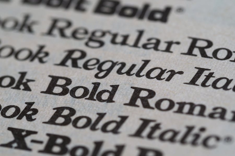
What Are Web Fonts (And Why They Matter for Promotion)?
Web fonts are fonts that load through your browser instead of being installed locally.
Common examples:
- Google Fonts
- Self-hosted premium fonts
- Variable fonts (modern, performance-friendly)
Here’s the part most miss:
👉 Fonts directly influence how well your site performs when you promote it.
If you’re running:
- SEO campaigns
- Paid ads
- Social traffic
- Email funnels
Your typography affects:
- Bounce rate
- Time on page
- Conversion rate
Which means it directly impacts ROI.
You can drive all the traffic you want—but if your site looks average, you lose the sale.
The Hidden Link Between Fonts and Website Promotion
Promotion of a website isn’t just about getting clicks. It’s about what happens after the click.
Let’s break it down.
When Someone Lands on Your Site:
- They judge your brand in under 2 seconds
- Typography is one of the first things they notice
- It signals quality instantly
Bad fonts = cheap perception
Strong fonts = authority and trust
That perception determines whether:
- They stay
- They scroll
- They buy
So your font choice directly affects:
👉 How well your marketing performs
Performance Still Comes First (Or Promotion Fails)
Before we get fancy with styling, reality check:
If your fonts slow your site down, your promotion suffers.
Why?
- Slower pages = higher ad costs
- Poor Core Web Vitals = weaker SEO rankings
- Delays = lost conversions
Best Practices
- Stick to 1–2 font families
- Use variable fonts where possible
- Self-host key fonts
- Use font-display: swap
- Preload critical assets
This ensures:
- Faster load times
- Better UX
- Stronger campaign performance
Enter Gold Leaf Fonts: A Promotion Power Move
Gold leaf fonts replicate the look of gold foil, metallic ink, or embossed lettering.
They’ve been used for decades in:
- Luxury packaging
- Premium print
- High-end branding
Now they’re being used online for one reason:
👉 They increase perceived value.
Why Gold Leaf Fonts Are So Effective for Website Promotion
This is where it gets interesting.
Gold fonts don’t just “look nice”—they actively improve marketing performance when used correctly.
1. They Increase Perceived Value
Visitors subconsciously associate gold with:
- Wealth
- Success
- Premium quality
This means:
👉 You can justify higher prices more easily
2. They Improve Conversion Rates
When your landing page feels premium:
- Offers feel more valuable
- Trust increases
- Buyers hesitate less
This is especially powerful for:
- High-ticket services
- Consulting
- SaaS offers
- Finance brands
3. They Make Your Ads Work Harder
If you’re running:
- Facebook Ads
- Google Ads
- Email campaigns
Your landing page must match the promise.
Gold accents in:
- Headlines
- Hero sections
- CTAs
Help reinforce:
👉 “You’re in the right place—and this is high quality.”
That alignment improves:
- Conversion rate
- Cost per acquisition (CPA)
- Return on ad spend (ROAS)
4. They Make Your Brand Memorable
Most websites look the same:
- Same fonts
- Same layouts
- Same feel
Gold typography instantly stands out.
Which means:
- Higher recall
- More direct traffic later
- Stronger brand identity
The Right Way to Use Gold Leaf Fonts (Without Killing Performance)
Most people overdo it—and ruin both UX and SEO.
Use Gold as an Accent, Not a Base
Good:
- Headlines
- Logos
- CTA highlights
Bad:
- Paragraph text
- Entire pages in gold
Pair with Fast, Clean Fonts
Your stack should look like:
- Base: Inter / system font
- Accent: gold-styled headline
This gives you:
- Speed
- Readability
- Visual impact
Use CSS Instead of Heavy Images
Avoid uploading gold text as images.
Instead:
.gold-text {
background: linear-gradient(90deg, #d4af37, #ffd700, #b8962e);
-webkit-background-clip: text;
-webkit-text-fill-color: transparent;
}
This keeps your site:
- Fast
- SEO-friendly
- Scalable
Think Like a Marketer, Not a Designer
Don’t ask:
“What looks good?”
Ask:
“What increases conversions?”
Use gold to highlight:
- Premium packages
- Key offers
- Authority statements
- Testimonials
Where Gold Fonts Fit in a Promotion Funnel
If you’re serious about marketing performance, placement matters.
Top of Funnel (Traffic Stage)
- Keep it clean and fast
- Minimal styling
Middle of Funnel (Trust Stage)
- Introduce subtle gold accents
- Highlight credibility
Bottom of Funnel (Conversion Stage)
This is where gold shines:
- Pricing sections
- Offers
- CTAs
👉 This is where people decide to buy
SEO Impact: The Indirect Advantage
Fonts don’t rank your site directly.
But they influence:
- Dwell time
- Bounce rate
- Engagement
And those feed into:
👉 Stronger SEO performance over time
A better-looking, faster, more trustworthy page =
- More backlinks supported by professional link building services
- Higher rankings
- Better traffic quality
Final Take: Fonts Are a Promotion Lever
If you’re investing in:
- SEO
- Ads
- Funnels
Then your typography is part of your marketing system.
Gold leaf fonts, when used properly, can:
- Elevate brand perception
- Increase conversions
- Improve campaign performance
But only if you balance:
- Speed
- Readability
- Strategic placement
Do that right, and your fonts stop being decoration…
…and start doing what they should have been doing all along:
👉 Helping you make more money from your traffic.