When selecting a font for your book, the choice goes beyond simple aesthetics—it influences how the content is experienced by readers. The font you use helps to set the tone and guides the reader’s perception of the book.
So, what font are books generally written in, and how can you select the best one for your manuscript? In this article, we’ll delve into the best fonts for both print and digital formats, including advice on choosing the right font for body text, headings, and titles.
The Importance of Font in Book Design
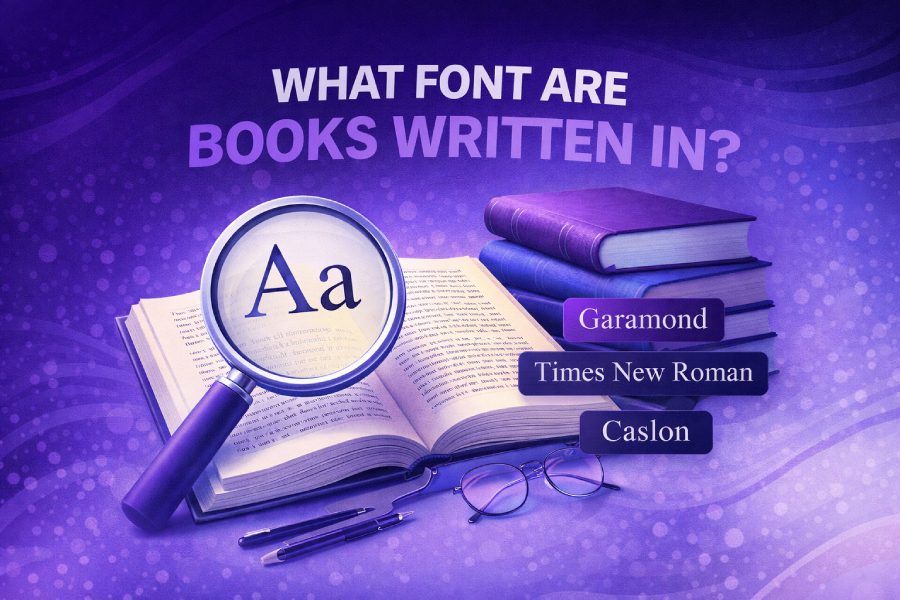
The font you choose plays a significant role in the readability of your book. Serif fonts like Times New Roman, Garamond, and Caslon are often the preferred choice for body text in print books due to their readability. These fonts are designed with small projections or “serifs” at the ends of the letters, which help guide the reader’s eye along the lines of text.
For digital books or eBooks, fonts such as Georgia and Merriweather are widely used because they maintain readability on screens, even in long reading sessions. If you’re publishing on platforms like Kindle Direct Publishing, KDP recommends fonts such as Arial and Georgia for their clarity and ease of use. To explore more about choosing the best font for your manuscript, you can learn how to change font in WordPress.
Serif vs. Sans Serif: Which One Should You Choose?
The decision between serif and sans-serif fonts is an important one in book design. Serif fonts, like Baskerville and Palatino, are favored for body text in print because the small serifs help the reader’s eye move across the page with ease. They offer a more traditional and formal look, which is why many classic books use these fonts for readability.
On the other hand, sans-serif fonts like Helvetica and Arial are often used for headings or short blocks of text. These fonts do not have the small projections at the ends of letters, which makes them ideal for modern designs or for titles and chapter headings. For books with a modern aesthetic, combining serif fonts for body text and sans-serif fonts for headings is a great way to create contrast. For more details on selecting the right font for your book, you can learn about fonts used in Outlook emails.
Best Fonts for Book Body Text
When selecting fonts for the body text of your book, it is crucial to prioritize legibility, as this is the longest part of your manuscript. Some of the best fonts for body text include Garamond, Times New Roman, and Minion. These fonts have been used in print for centuries and are known for their readability, allowing readers to engage with long texts without straining their eyes.
Garamond, in particular, is a classic choice for its elegant curves and efficient use of space. Its readability has made it a favorite in the publishing industry. If you’re publishing digitally, Georgia is an excellent option, offering clear, crisp text that remains legible across different screen sizes. For tips on pairing fonts for your book, learn more about LinkedIn font choices.
Fonts for Book Headings and Titles
Headings and titles are one of the first things readers notice, so they should make an impact. While body text should be easy to read, your headings should stand out and reflect the tone of your book. Sans-serif fonts like Helvetica and Arial are often used for headings, as they are clean and simple, making them ideal for attention-grabbing titles.
However, you can also use serif fonts for headings, such as Baskerville, to maintain a cohesive look while giving your book a formal touch. The key is ensuring your headings are legible and work well with the body text. Experiment with different combinations to find the best balance between aesthetics and readability.
Choosing Fonts for Your Book’s Genre
The font you choose should be in harmony with your book’s genre and its intended audience. For historical fiction, fonts like Caslon or Georgia work well, as they provide a traditional, timeless feel. On the other hand, for thrillers or self-help books, fonts like Helvetica or Arial are more fitting because they’re clean and modern.
For genres like fantasy or science fiction, you might want to use custom fonts that help set the tone of the book. Unique, futuristic fonts can create an immersive experience, while fonts with rounded edges might give off a warmer, more inviting feel. Experiment with different styles to see what fits best with your book’s mood.
The Best Fonts for Print and Digital Books
For print books, selecting the right font is crucial for both readability and design. Times New Roman is commonly used for its classic, easily readable style. For eBooks, however, you’ll want to choose a font that looks great on screens. Fonts like Merriweather and Georgia are designed for digital use and provide excellent clarity, even on smaller devices like smartphones or eReaders.
Many readers now consume books on digital devices, so font choice is essential for enhancing the reading experience. If you’re publishing both in print and digitally, fonts like Georgia and Merriweather work well across both formats. For a detailed guide on making the best font choices, you can refer to this post on the font used in Gmail.
The Role of Fonts in Book Design
Fonts play a significant role in the emotional tone of a book. For instance, fonts like Times New Roman or Garamond lend a professional, serious tone to nonfiction books, while fonts like Helvetica or Arial are more suitable for books that aim for a modern or minimalist feel. The key is to choose a font that complements your book’s content and genre.
Font choices can also influence how your reader perceives your writing. A playful, handwritten font might evoke a sense of whimsy, while sleek, geometric fonts might convey clarity and precision. Be sure to pick fonts that not only match the tone of your writing but also enhance the reader’s experience.
Final Thoughts on Choosing the Right Font
In conclusion, selecting the right font for your book is essential to creating a pleasant reading experience. Times New Roman, Garamond, and Georgia are all excellent choices for body text in both print and digital formats. Headings, however, give you more flexibility—consider mixing serif and sans-serif fonts for the best results.
For more advice on fonts and how they affect the design and readability of your manuscript, learn about fonts used in LinkedIn.
Conclusion
We covered the fonts most commonly used in book publishing, the differences between serif and sans-serif fonts, and how to choose fonts that complement your book’s genre. Whether you’re designing a print book or preparing for digital publishing, the right font can significantly enhance the reading experience.
Make sure to test fonts to ensure they align with your book’s tone and theme, and don’t forget to pair fonts effectively for headings, body text, and titles.
FAQs
What is the best font for book body text?
The best fonts for book body text are serif fonts like Garamond, Times New Roman, and Georgia. These fonts improve readability by guiding the reader’s eye along the text, making them ideal for long reading sessions.
Should I use serif or sans-serif fonts for book headings?
For book headings, sans-serif fonts like Helvetica or Arial work well. They are bold and clear, helping the headings stand out. However, combining serif fonts for the body text and sans-serif fonts for headings creates a balanced design.
What font do professional book publishers use?
Professional book publishers often use Garamond, Times New Roman, and Caslon for body text. These fonts are easy to read and have a classic, timeless appeal. The choice may vary depending on the genre and tone of the book.
Can I use different fonts for different book genres?
Yes, the font you choose should reflect your book’s genre. For example, Georgia is great for historical fiction, while Helvetica suits modern, contemporary genres. Custom fonts can be used to add a unique feel to specific genres like fantasy.
How do I choose a font for my book’s cover?
When choosing a font for your book’s cover, consider legibility, style, and genre. Use bold, sans-serif fonts like Arial for a modern look, or serif fonts like Baskerville for a more traditional, elegant appearance.
Are digital books and print books fonts different?
Yes, fonts for print books often include serif fonts like Garamond, while digital books may use fonts like Georgia or Merriweather, designed for clarity on screens. Digital fonts prioritize easy reading on various screen sizes and resolutions.
What font size should I use for book body text?
For book body text, a font size between 10 to 12 points is typically recommended. This range ensures readability without taking up too much space on the page, making it comfortable for readers during long reading sessions.
What is the most readable font for eBooks?
Georgia and Merriweather are among the most readable fonts for eBooks. These fonts are optimized for screen readability, maintaining clarity on various devices like eReaders, tablets, and smartphones. Their design ensures a pleasant reading experience on digital platforms.
Can I mix fonts in my book design?
Yes, mixing fonts in your book design can add variety and emphasis. Typically, pairing a serif font for body text with a sans-serif font for headings creates a nice balance. However, ensure the fonts complement each other to maintain readability.
How do I test a font for my book?
To test a font for your book, print sample pages or view them digitally. Pay attention to how the text flows, legibility, and the overall tone. Test different font sizes to ensure readability and aesthetic appeal for your audience.