When crafting your resume, the font you choose plays a crucial role in making a great first impression. After all, it’s not just about what you say but how you present it.
A clear, readable font shows professionalism and ensures your resume is easy to scan, which is essential in today’s fast-paced job market. The right font can elevate your resume and make your application stand out from the competition.
Let’s dive into the best fonts you should consider and why.
The Importance of Choosing the Right Font for Your Resume
Selecting the correct font is key to ensuring that your resume stands out. A resume that’s difficult to read or too cluttered with fancy fonts might deter employers. Research shows that simplicity often works best, but it’s important to choose a font that matches the tone of the job you’re applying for. For example, creative industries may allow for more artistic fonts, while traditional roles may demand more formal, readable choices. For further guidance on font selection for resumes, check out this article on best resume fonts.
When considering font style, you need to keep in mind that readability is essential. Serif fonts, like Times New Roman or Georgia, are classic and readable for traditional roles. On the other hand, sans-serif fonts, such as Arial or Helvetica, offer a modern, clean look that’s easy on the eyes. Ensure the font you choose is legible in both printed and digital formats to avoid frustrating potential employers.
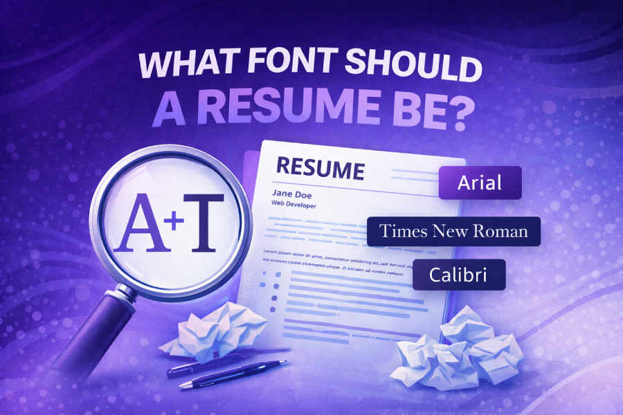
Top Fonts to Use for Your Resume
1. Calibri
Calibri is often regarded as one of the best resume fonts. It’s a clean, modern sans-serif font that’s commonly used in many professional documents. Its neat appearance ensures your resume looks polished and professional. Calibri also works well in various font sizes, ensuring readability without sacrificing style. If you’re unsure which font to pick, Calibri is always a safe and versatile option.
2. Arial
Arial is a widely used sans-serif font that is both professional and easy to read. It’s particularly effective in digital formats, ensuring that your resume looks great on any screen. Arial is widely accepted across industries, making it an excellent choice for any job application. If you’re aiming for a modern and simple look, Arial won’t disappoint. You can read more about how to change font in WordPress for a more tailored experience when adjusting fonts for your resume.
3. Georgia
Georgia is a serif font that brings a traditional, formal look to your resume. This font is highly readable, even in smaller sizes, and offers a sense of elegance. It’s a great option for industries where professionalism is highly valued, such as finance or law. To maintain clarity and avoid overwhelming your resume, use Georgia in sizes ranging from 10 to 12 points.
4. Times New Roman
Times New Roman is a classic serif font that exudes a sense of formality. While it’s often considered a bit outdated, it remains widely accepted, particularly in conservative fields such as law, finance, or academia. If you’re applying for a more traditional role, Times New Roman can be a suitable choice for your resume.
Font Size: Finding the Sweet Spot
Font size is equally as important as font choice when it comes to readability. Ideally, your resume should be easy to read at a glance without appearing too crowded or too empty. The standard font size for resumes is between 10 and 12 points, depending on the font style.
For example, with a serif font like Times New Roman or Georgia, you may want to go with a 12-point font for body text. If you opt for a sans-serif font like Calibri or Arial, you can use a slightly smaller size, like 10 or 11 points, since sans-serif fonts tend to appear larger than serif fonts at the same size. Adjust the size of section headings, ensuring they stand out without being too overpowering.
Best Font for ATS (Applicant Tracking System)
Many employers use Applicant Tracking Systems (ATS) to screen resumes before they even reach a hiring manager. ATS software scans resumes for keywords and formatting, so it’s crucial to select an ATS-friendly font. Avoid decorative fonts or anything that could disrupt the flow of your resume’s text.
Opt for simple, easy-to-read fonts like Calibri, Arial, or Helvetica. These fonts are compatible with most ATS systems and ensure your resume is parsed correctly. For tips on optimizing your resume for ATS, you can review the helpful guide on best resume fonts.
Why Avoid Certain Fonts?
There are some fonts you should steer clear of when crafting your resume. Fonts like Comic Sans, Papyrus, or Brush Script may be seen as unprofessional, and could even harm your chances of getting the job. While they may be fun, they don’t convey the professionalism most employers are looking for. Stick with fonts that reflect your skills and qualifications in a polished manner.
Unprofessional Fonts to Avoid:
- Comic Sans: This playful font is often associated with informal or childlike communication.
- Papyrus: While quirky, this font has been overused and carries a connotation of amateur design.
- Brush Script: Often used in invitations or greeting cards, this script-style font can appear overly decorative for a resume.
If you’re looking for professional font tools for modern designers, consider using tools like Professional font tools for modern designers to select the best fonts for your needs. These tools provide a range of options that are both professional and visually appealing, ensuring your resume gets noticed for the right reasons.
Formatting Your Resume: Font and Beyond
The font you choose is just one aspect of resume formatting. It’s essential to keep margins, line spacing, and section headers consistent and neat. Margins should typically be set to 1 inch on all sides for a clean, balanced look. Use bullet points to break up large blocks of text, making your resume easier to skim.
While font choice and size are essential, overall document design should also be considered. Clean, consistent formatting helps employers quickly find the information they need, improving your chances of landing an interview. It’s important to ensure that your contact information, job experience, education, and skills are organized in a clear, concise manner. Consider using tools like resume builders which can automate this process ensuring everything is formatted and displayed correctly.
For more tips on formatting your resume, learn how to change font in WordPress. Improve your knowledge on how to adjust font settings in various platforms.
Using Fonts to Reflect Your Industry
When choosing a font, it’s essential to consider the industry you’re applying to. In creative fields like graphic design, advertising, or marketing, fonts that express creativity can work well. However, in more conservative industries like law or banking, fonts should reflect professionalism and tradition.
If you’re applying for a tech job, fonts like Helvetica or Calibri may be more suitable, as they convey modernity and precision. For fields like publishing or journalism, fonts such as Georgia or Times New Roman are often preferred due to their classic and authoritative look.
Conclusion:
In conclusion, selecting the right font for your resume is more than just a stylistic choice. It’s about presenting yourself as professional, readable, and tailored to the job you’re applying for. Always prioritize simplicity, readability, and ATS compatibility when choosing your resume font.
Whether you choose a modern sans-serif font like Calibri or a traditional serif font like Times New Roman, make sure it suits your career field and the job role you’re applying for. Ultimately, your resume is your first opportunity to make a great impression. A well-chosen font is a small but essential element that could help you land that dream job.