Think of a bright red background with a sweeping white cursive font. You instantly recognize the brand without even reading the words. That’s the magic of typography. It works behind the scenes to communicate exactly who you are to your audience.
When you start your business and build a website, choosing your fonts is a big decision. It’s not just about picking something pretty, it’s about creating a visual voice for your company.
This guide will show you how typography shapes customer perception and the psychology behind different font styles. By the end, you’ll have tips to pick the perfect fonts and build a brand people remember.
TL;DR
Typography is crucial in shaping how customers perceive your brand. This guide explores the psychology of fonts and provides practical tips to help you select fonts that enhance your company’s visual identity and memorability.
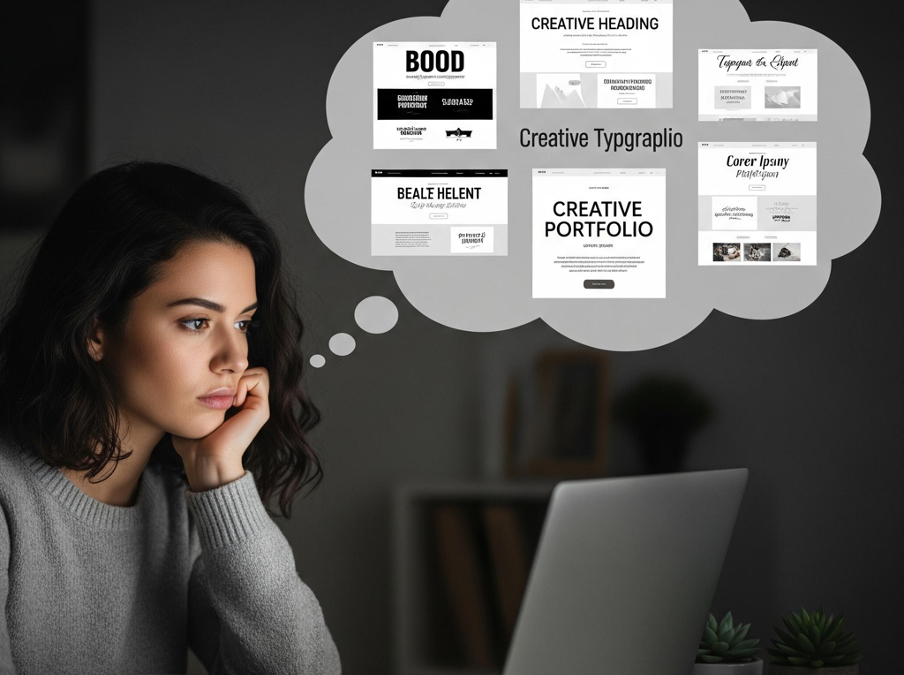
Start strong with an easy website builder
Creating a beautiful brand does not have to be a frustrating or complicated process. When you use an easy website builder, like Wix, you get access to hundreds of professional fonts right out of the box. You can experiment with different styles and see how they look on your pages in real-time. This removes the guesswork from design and lets you focus completely on your message. Additionally, exploring options like a Squarespace discount can make it even more cost-effective to access premium design features and elevate your brand presence.
Your website acts as the central hub for your business. The fonts you select will live on your homepage, your product descriptions, and your blog posts. Having a platform that makes testing and changing these fonts simple gives you a massive advantage. And if you’ve ever wondered how to find fonts on a website, modern website builders make it incredibly easy by letting you preview, identify, and switch fonts without any technical hassle. While these tools remove the manual effort for individuals, for teams that need deeper integration, a website builder api can make it easier to automate design workflows and scale branded websites across multiple platforms.
You can build a cohesive, attractive brand identity in just a few clicks. A website creator empowers you to make confident design choices, ensuring your typography always reflects your unique vision and values.
What is typography and why does it matter?
Typography is the art and technique of arranging type to make written language legible, readable, and appealing. It involves choosing typefaces, point sizes, line lengths, line spacing, and letter spacing. While it sounds incredibly detailed, the goal is simple: making your words look exactly how they should feel.
Before a visitor reads a single word on your page, they process the visual information. Typography sets the mood immediately. If you run a high-end financial firm, a bubbly, playful font will confuse your potential clients. They expect stability and seriousness.
On the other hand, if you sell handmade children’s toys, a rigid, corporate font will feel totally out of place. Typography bridges the gap between what you say and how you say it. It ensures your visual presentation perfectly matches your spoken message.
How fonts influence customer perception
Every font family carries its own distinct personality. Our brains have been trained over decades to associate certain shapes with specific feelings. Understanding these categories helps you choose the right vibe for your business.
Serif fonts build trust and tradition
Serif fonts are the ones with small decorative lines, or “feet,” at the ends of their letters. Think classic fonts like Times New Roman or Georgia. They feel established, reliable, and traditional.
Because we’ve seen them in print for centuries (think newspapers and books), our brains connect them with authority. If your business is in law, finance, or education, a serif font tells your audience that you’re a serious professional they can trust. You can use a Serif font generator to try out different options and see which one best fits your brand.
Sans-serif fonts feel modern and clean
Sans-serif fonts drop those little decorative lines. Fonts like Arial, Helvetica, and Proxima Nova fall into this category. They are clean, minimal, and highly legible on screens.
These fonts communicate a modern, forward-thinking attitude. Technology companies, modern fashion brands, and creative agencies love sans-serif fonts because they feel approachable and uncluttered. They give your brand a fresh, contemporary look.
Script fonts add a personal touch
Script fonts mimic the fluid strokes of human handwriting or calligraphy. They range from elegant and formal to casual and messy.
These fonts are incredibly expressive. They are perfect for brands that want to feel personal, artistic, or luxurious. Wedding photographers, boutique bakeries, and beauty brands often use script fonts to add a touch of elegance and individual personality to their logos.
Display fonts bring the fun
Display fonts are the wildcards of the typography world. They are highly decorative and meant to be used at large sizes, like in headlines or logos.
These fonts command attention. They can be blocky, distressed, playful, or futuristic. You should use them sparingly, as they can be hard to read in long paragraphs. However, when used for a bold header, they inject massive amounts of personality into your design.
The psychology behind brand recognition
Recognition happens when a customer can identify your brand without seeing your actual name. Typography is a massive driver of this phenomenon. It all comes down to the power of consistency and visual memory.
When you use the exact same fonts across your website, social media, packaging, and emails, you train your audience. Their brains start linking those specific letter shapes to your specific business. If you change your fonts every week, you break that mental link and confuse your audience.
Building a recognizable brand comes down to consistency. When customers instantly recognize your fonts, they feel a sense of comfort and familiarity, which builds trust. They know what your business is about, making them more likely to choose you over a competitor. This guide to stylish typography will help you create that instant connection.Actionable tips for choosing your brand fonts
Ready to pick the fonts that will represent your business? Follow these straightforward rules to create a beautiful, effective typography system.
Keep your pairings simple
You rarely need more than two or three fonts for your entire brand. Using too many different styles makes your website look messy and unprofessional.
A foolproof strategy is to pick one strong font for your headlines and one clean, easy-to-read font for your body text. A popular approach is pairing a bold serif header with a simple sans-serif body text. This creates a beautiful contrast that guides the reader’s eye naturally down the page.
Prioritize readability across devices
Your words only work if people can actually read them. Always prioritize legibility over fancy design.
A stylish script font might look great on a desktop, but it could be unreadable on a mobile phone. Since most people browse on their phones, mobile-friendliness is super important. Test your font choices on different devices to make sure your text is clear and easy to read everywhere.
Your body text should be large enough to read without zooming in, and there needs to be enough contrast between your text and background colors. These aren’t just good design tips, they’re essential for your website’s accessibility and can even impact your search engine rankings. Search engines like mobile-optimized sites, so a readable, responsive design helps you show up in more searches, especially for people looking for businesses in your area.
Match the font to your brand personality
Write down three adjectives that describe your business. Are you playful, energetic, and young? Or are you sophisticated, calm, and luxurious?
Look at those adjectives while you browse font options. If you are a playful brand, a rounded, bubbly sans-serif font might be the perfect fit. If you are sophisticated, a tall, elegant serif font will serve you better. Let your brand personality dictate your design choices.
Test your choices with real readers
Before you finalize your typography, get some outside opinions. Show your website draft to a few friends or colleagues.
Ask them how the fonts make them feel. Ask them if they have any trouble reading the paragraphs. Sometimes, you get so close to a project that you miss obvious readability issues. A fresh pair of eyes will tell you exactly if your typography is doing its job correctly.
Bring your brand to life
Typography is the silent ambassador of your brand. It speaks volumes about your quality, your personality, and your professionalism before a single word is processed. By making intentional, thoughtful font choices, you build a powerful visual identity that people remember.
You have the knowledge to make smart design decisions. Now it is time to put those ideas into action. Log into your website platform, explore the typography settings, and start shaping the exact way you want the world to see your business.