When it comes to branding, the choice of font can play a crucial role in conveying a company’s identity. LinkedIn, the world’s largest professional networking platform, is no exception.
Understanding what font LinkedIn uses, why it was chosen, and how it aligns with the platform’s values can help you make more informed decisions for your own professional presence.
In this article, we will dive deep into LinkedIn’s font choices and their evolution over time, offering insights into the significance of the font in the world of digital branding.
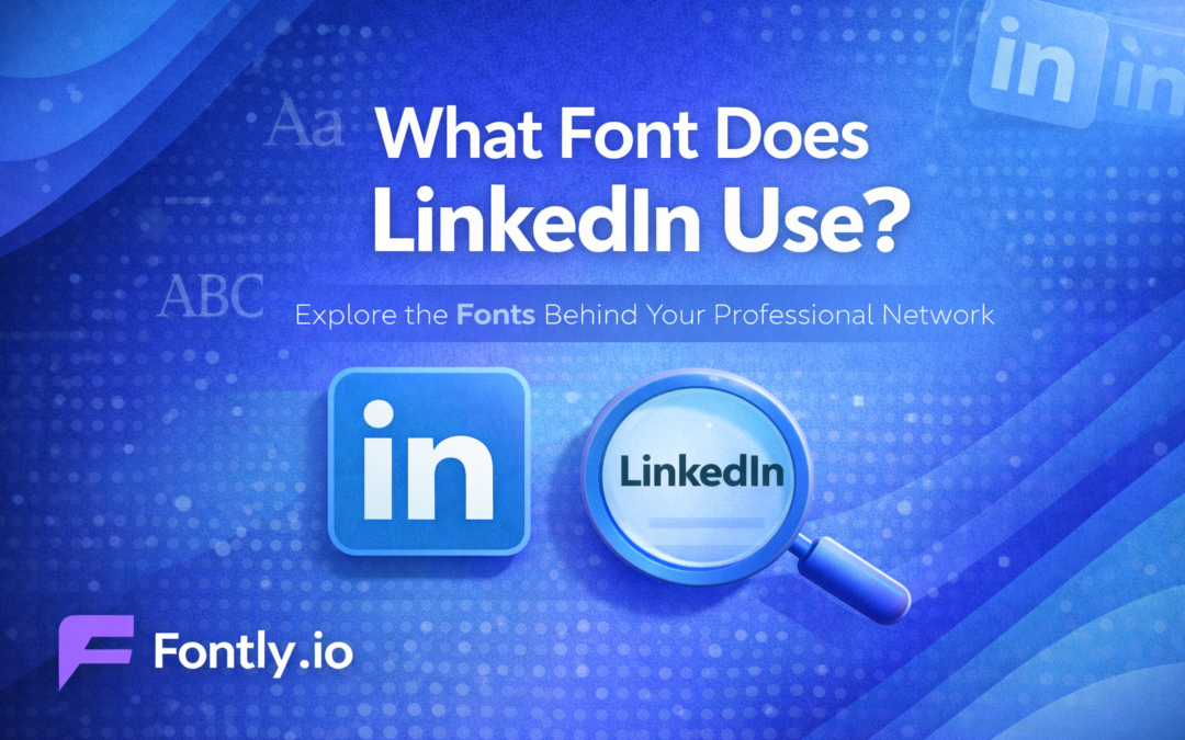
LinkedIn’s Primary Font: Avenir Black
The font used in LinkedIn’s logo is Avenir Black, a sleek, modern, and geometric sans-serif font designed by Adrian Frutiger. This font, with its clean lines and contemporary feel, aligns perfectly with LinkedIn’s image as a forward-thinking, professional platform. Avenir Black replaced the previous font, Myriad Pro, which was used in LinkedIn’s original logo design. The switch to Avenir Black was part of a broader branding update that took place in the early 2010s.
Avenir Black is now the primary font used in the LinkedIn logo, and it’s immediately recognizable due to its strong, confident lines. The geometric style of Avenir Black reflects LinkedIn’s commitment to professionalism, making it an excellent choice for a platform focused on networking, business, and career advancement.
If you want to understand more about how fonts affect branding, check out this guide on how to build brand advocates for your business.
The Evolution of LinkedIn’s Font Choices
LinkedIn’s font history began with Myriad Pro, a humanist sans-serif typeface that was widely used in corporate branding at the time. Myriad Pro was a versatile and approachable font that worked well across multiple applications, but as LinkedIn’s brand began to mature and evolve, a shift was made to a more modern, refined look. This led to the adoption of Avenir Black in 2012.
The switch to Avenir Black helped give LinkedIn a more distinctive identity, one that set it apart from other professional networks and underscored its focus on business and innovation. The clean, geometric shapes of Avenir Black now symbolize LinkedIn’s move towards a more streamlined and professional brand, signaling that the platform was not just a social network but a serious business tool.
In parallel, many platforms have undergone similar font evolutions to better reflect their changing identities. The article on what font does Spotify use can give you a glimpse into how other social platforms make these strategic decisions.
Why LinkedIn Chose Avenir Black
When selecting a font for its branding, LinkedIn needed a typeface that would be both modern and timeless. Avenir Black fit these criteria perfectly. Its geometric design conveys clarity and precision, traits that are essential for a professional platform like LinkedIn. Additionally, the font’s boldness ensures that it stands out in both print and digital mediums, which is crucial for brand recognition.
Avenir Black also offers a sense of stability and trust, which is particularly important for LinkedIn as it serves as a platform for career networking, job hunting, business communication, and professional development. By opting for a clean and modern sans-serif font, LinkedIn was able to create a logo that resonates with its target audience: professionals seeking meaningful connections and opportunities.
LinkedIn’s Profile Font Choices
While LinkedIn’s logo features Avenir Black, the fonts used throughout the site’s interface are more focused on legibility and ease of use. For its profile pages and other sections, LinkedIn uses a combination of Arial and Helvetica Neue, two classic sans-serif fonts that are widely recognized for their readability. These fonts are clean, straightforward, and easily legible on both desktop and mobile devices.
LinkedIn’s choice of fonts for its profile pages aligns with its goal of maintaining a simple yet professional design. The fonts used here are optimized for reading, ensuring that users can easily browse profiles, read resumes, and view job descriptions without any distraction from complex or ornate typography.
How to Use LinkedIn’s Fonts in Your Profile
While you cannot directly use custom fonts in LinkedIn’s profile text fields, a banner text generator can help you create visually appealing text for your LinkedIn banner. The platform allows you to format your profile text with different styles such as bold, italic, and underlined. You can use these formatting options to highlight key sections of your profile, like your skills, experience, and headline.
Additionally, you can leverage custom fonts in your LinkedIn banner by uploading a banner image that includes your preferred font. This allows you to personalize your profile visually, even though you cannot directly change the text font in the profile text sections.
The Impact of Fonts on Branding
Fonts are more than just text on a screen—they are an essential element of your brand’s identity. A well-chosen font can convey emotions, set the tone for your messaging, and help build recognition and trust with your audience. LinkedIn’s use of Avenir Black in its logo and Arial/Helvetica Neue on the platform highlights the importance of consistency in branding.
For instance, the sleek, modern design of Avenir Black reinforces LinkedIn’s professional nature, while the clean readability of Arial and Helvetica Neue makes the platform accessible and easy to navigate. Together, these fonts create a cohesive user experience that matches LinkedIn’s commitment to helping professionals succeed.
Understanding Font Choices Across Major Brands
LinkedIn isn’t the only major platform to make strategic font choices. Other platforms, such as Facebook, Twitter, and Instagram, also use distinct fonts to reflect their branding.
For instance, Facebook uses Helvetica Neue, a clean and modern font that aligns with its social platform while ensuring readability across various devices. Twitter, on the other hand, uses Roboto, which offers a more digital-friendly feel. Understanding the fonts of these platforms helps you understand the nuances of how typography influences user perception and platform identity.
Best Practices for Using Fonts on Your LinkedIn Profile
If you want to stand out on LinkedIn and make your profile visually appealing, you can still apply some best practices with font choices and formatting. Consider the following tips:
- Use bold and italics sparingly: This allows you to highlight important information without overloading your profile with too much emphasis.
- Keep your fonts simple: Stick with fonts that are easy to read. While you can’t directly change the font on LinkedIn, you can create visually striking headlines and summary sections that capture attention.
- Ensure mobile compatibility: Since LinkedIn is widely used on mobile devices, make sure your formatting looks good on both desktop and mobile views.
Conclusion
Understanding the font LinkedIn uses is key to appreciating the platform’s overall branding strategy. From Avenir Black in its logo to Arial and Helvetica Neue on its platform, LinkedIn’s font choices reflect its commitment to professionalism, readability, and simplicity.
By using these fonts, LinkedIn not only ensures a cohesive visual identity but also builds trust with its users. Whether you’re optimizing your LinkedIn profile or designing your own brand, choosing the right font can help you project the right image and message to your audience.